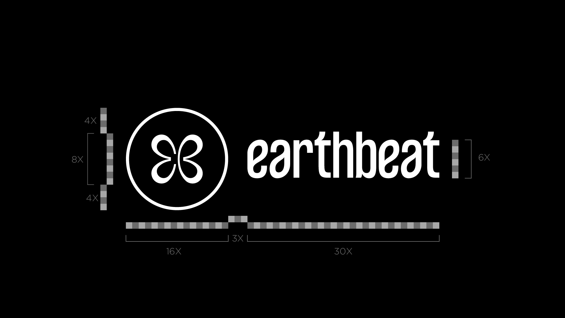
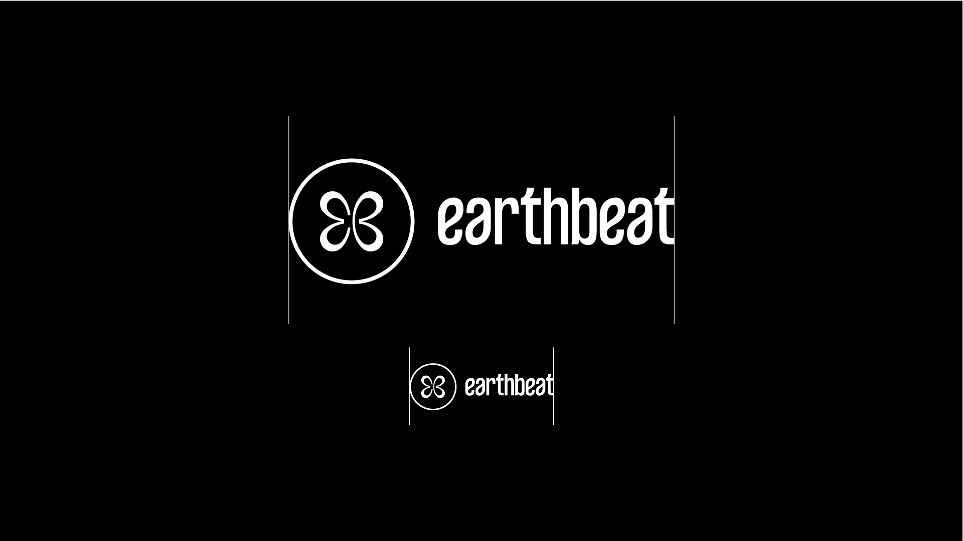
Earthbeat is a vibrant brand that connects nature and rhythm through its unique visual identity. The brand's essence is captured in its distinctive pictogram and lettering. The pictogram is formed by two nearly identical, mirrored graphic elements that represent the initials of the name: E (earth) and B (beat). These elements combine to create a unified shape that symbolizes various values: the wings of a butterfly, the petals of a flower, and two intersecting hearts. To enhance its identity, we designed a cohesive visual representation that embodies Earthbeat’s dynamic and harmonious spirit. This approach ensures that the brand’s visuals convey its core message effectively, resonating with its audience on multiple levels.
Project Title: Earthbeat Festival Logo
Project Type: Logo Design
Date: February 2022